Summary
The Product field allows the creation of products in the form. There are several options for the type of field that should be used for the Product Field: Single Product, Drop Down, Radio Buttons, and User Defined Price. It is available under the Pricing Fields section within the form editor.


Note: When using a choice-based field type and your choice labels contain any HTML or special characters such as ampersands, commas, pipes, hyphens, or brackets of any type, you MUST enable the show values feature and give each choice a simple and unique value which does not contain any special characters. Failure to configure values could cause issues for features such as calculations, conditional logic, dynamic population, and validation. The value for each choice must be unique in any case, even if you’re not using HTML or special characters for the choice labels.
Common Settings
This field uses only common field settings for the Appearance and Advanced settings. For a description of each of the common field settings, refer to this article. Below you will find description of specialty settings that are particular to this field.
General Settings

Field Type
Select the type of field from the available form fields.
| Field | Description |
|---|---|
| Single Product | The Single Product field type will display the price and a quantity field by default. |
| Drop Down | The Drop Down field type will display as a drop down field on your form. When this option is selected, the General tab will refresh with options to specify multiple products. See Choices. |
| Radio Buttons | Similar to the Drop Down option, but radio buttons instead. See Choices. |
| User Defined Price | The User Defined Price field type will display as a single line input on your form. |
| Hidden | If set to Hidden, the product field will not be shown, but will still be processed upon submission. |
| Calculation | Generates product information based on calculations. See this article for an example and the rules on using calculations. |
Price
Enter the base price for this product.
Disable Quantity Field
Disables the quantity field. A quantity of 1 will be assumed or you can add a Quantity field to your form from the Pricing Fields.
Choices
For Product fields set to Drop Down or Radio Buttons field type, you would see the Edit Choices button, which would allow you to edit the Label, Value, and Price for each choice.

Click the Edit Choices button under Choices to open the Edit Choices flyout.
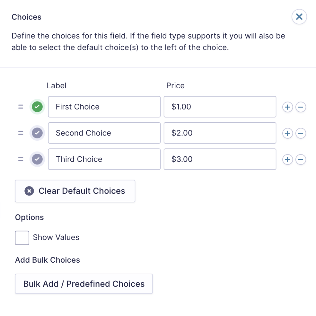
| Setting | Description |
|---|---|
| Choices | Add Choices to this field. You can mark each choice as checked by default by using the checkbox that appears to the left of each choice. Add a new choice by clicking the PLUS (+) icon and delete a choice by clicking the DELETE (-) icon. |
| Show Values | Allows you to specify a value for each choice. Choice values are not displayed to the user viewing the form but are accessible to administrators when viewing the entry. |
| Clear default choices | Allows you to clear the choice set as default. Only available when a choice has been selected as the default choice. |
| Bulk Add / Predefined Choices | Allows you to select a category and customize the predefined choices or paste your own list to bulk add choices. See note 1. |
Notes
1. See this article for more information on bulk loading choices.
Merge Tags
For more information on the use of merge tags, refer to these articles.
Usage
Single Product. Use sub-input notation only:
{Product Name:1.1} - Product name
{Product Name:1.2} — Price
{Product Name:1.3} — Quantity
Radio Buttons and Drop Down. Use modifiers only.
{Product Name:1} - Selected choice display label
User Defined Price
{Product Name:1} - Raw number entered by user
Modifiers
The following modifiers are available for choice-based field types (Radio Buttons and Drop Down):
| Modifier | Description |
|---|---|
| :value | Returns the selected choice value. Only differs from the display label when Show Values is enabled. Supported for Drop Down, Radio Buttons. |
| :price | Returns the raw numeric price (e.g., `50`). Supported for Drop Down, Radio Buttons. |
| :currency | Returns the price formatted as currency (e.g., `$50.00`). Supported for Drop Down, Radio Buttons and User Defined. |
Note: These modifiers do not apply to Single Product fields. Single Product fields use only sub-input notation (`.1/.2/.3`).
Validation
When the product type is set to User Defined Price, validation checks that the submitted value is a valid positive number. If the value cannot be parsed as a number or is negative, the field fails with the message “Please enter a valid amount.” Empty submissions are not checked.
When the product type is set to Calculation, validation checks the quantity input. If the field is marked as required and the quantity has not been provided, the field fails with the standard required message. If a quantity has been provided, validation checks that it is a whole number greater than or equal to zero. Decimal values are not accepted.
When the product type is set to choice-based, the field validates that the submitted values match the configured choices. Refer to the State Validation article for more information.