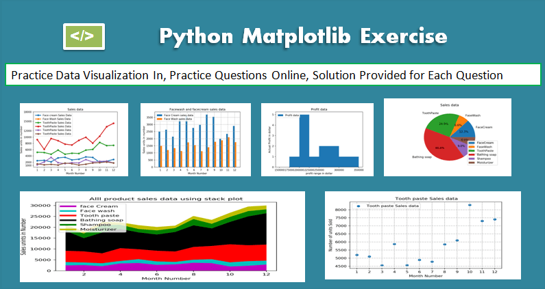
This Matplotlib exercise project helps Python developers learn and practice data visualization using Matplotlib by solving multiple questions and problems.
Matplotlib is a Python 2D plotting library that produces high-quality charts and figures, which helps us visualize extensive data to understand better. Pandas is a handy and useful data-structure tool for analyzing large and complex data.
In this exercise, we are using Pandas and Matplotlib to visualize Company Sales Data.
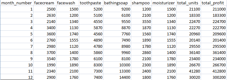
Use the following CSV file for this exercise. Read this file using Pandas or NumPy or using in-built matplotlib function.
What included in this Matplotlib Exercise?
This exercise contains ten questions. The solution is provided for each issue. Each question includes a specific Matplotlib topic you need to learn. When you complete each question, you get more familiar with Data data visualization using matplotlib.
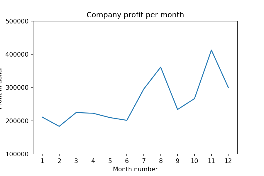
Exercise 1: Read Total profit of all months and show it using a line plot
Total profit data provided for each month. Generated line plot must include the following properties: –
- X label name = Month Number
- Y label name = Total profit
The line plot graph should look like this.
Show Solution
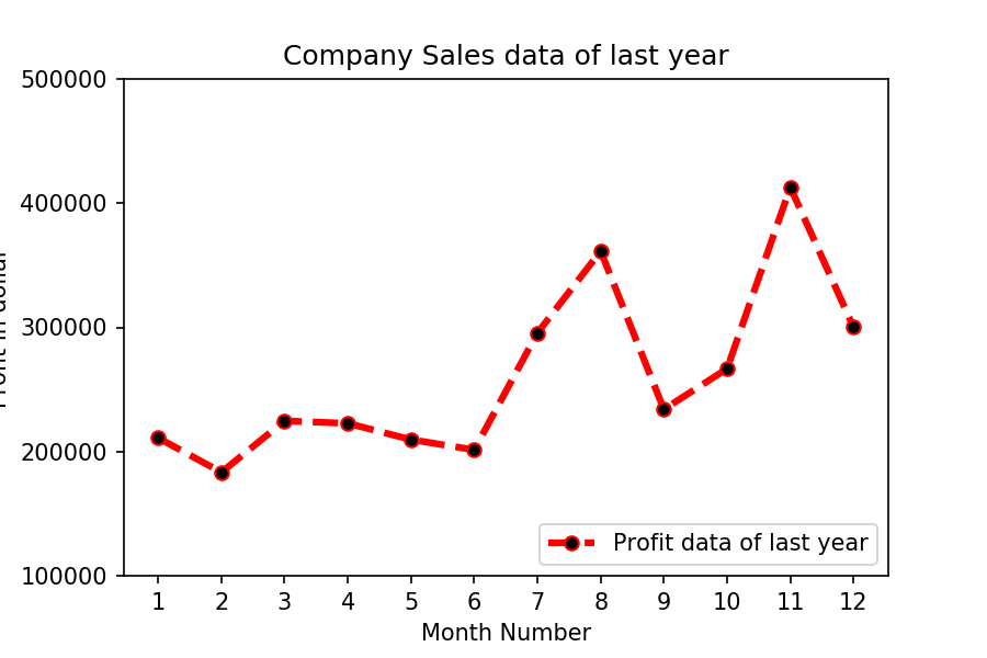
Exercise 2: Get total profit of all months and show line plot with the following Style properties
Generated line plot must include following Style properties: –
- Line Style dotted and Line-color should be red
- Show legend at the lower right location.
- X label name = Month Number
- Y label name = Sold units number
- Add a circle marker.
- Line marker color as read
- Line width should be 3
The line plot graph should look like this.
Show Solution
Exercise 3: Read all product sales data and show it using a multiline plot
Display the number of units sold per month for each product using multiline plots. (i.e., Separate Plotline for each product ).
The graph should look like this.

Show Solution
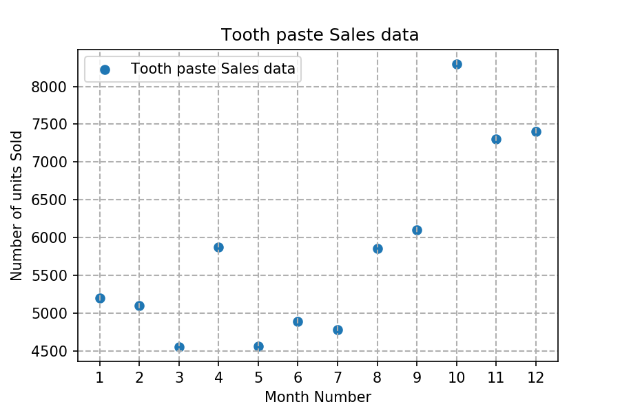
Exercise 4: Read toothpaste sales data of each month and show it using a scatter plot
Also, add a grid in the plot. gridline style should “–“.
The scatter plot should look like this.
Show Solution
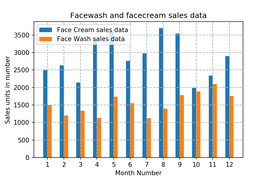
Exercise 5: Read face cream and facewash product sales data and show it using the bar chart
The bar chart should display the number of units sold per month for each product. Add a separate bar for each product in the same chart.
The bar chart should look like this.
Show Solution
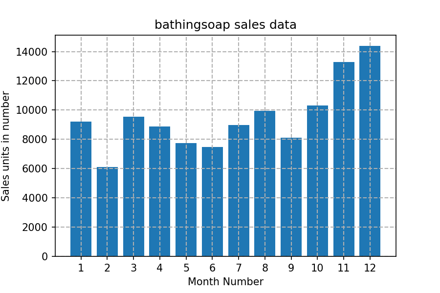
Exercise 6: Read sales data of bathing soap of all months and show it using a bar chart. Save this plot to your hard disk
The bar chart should look like this.
Show Solution
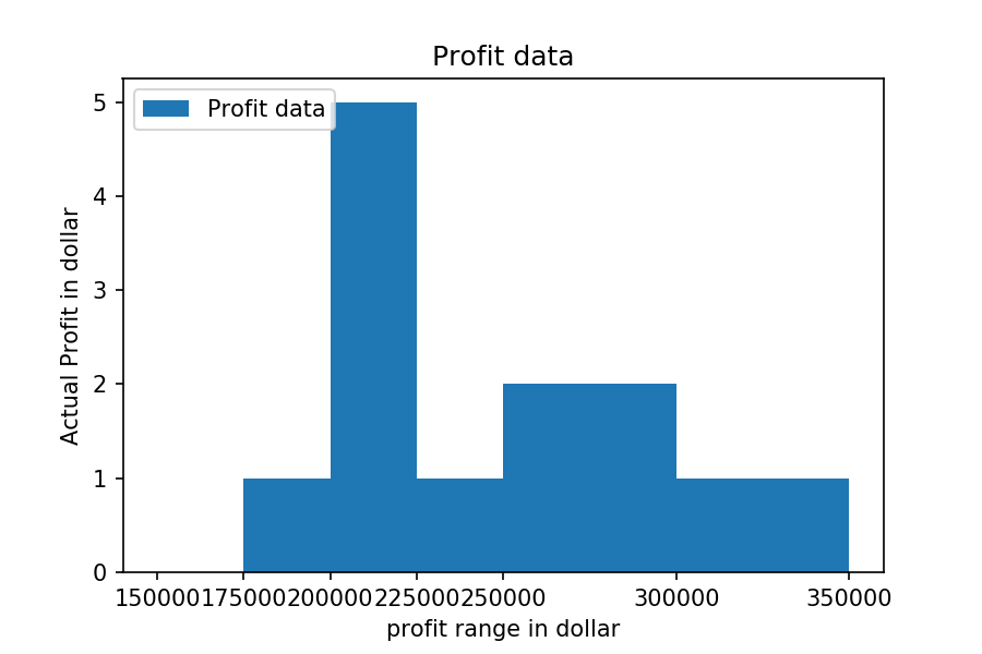
Exercise 7: Read the total profit of each month and show it using the histogram to see the most common profit ranges
The histogram should look like this.
Show Solution
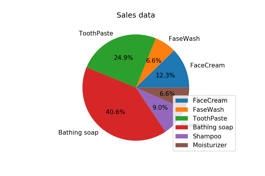
Exercise 8: Calculate total sale data for last year for each product and show it using a Pie chart
Note: In Pie chart display Number of units sold per year for each product in percentage.
The Pie chart should look like this.
Show Solution
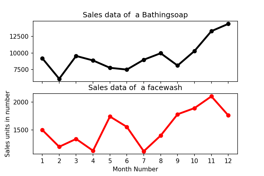
Exercise 9: Read Bathing soap facewash of all months and display it using the Subplot
The Subplot should look like this.
Show Solution
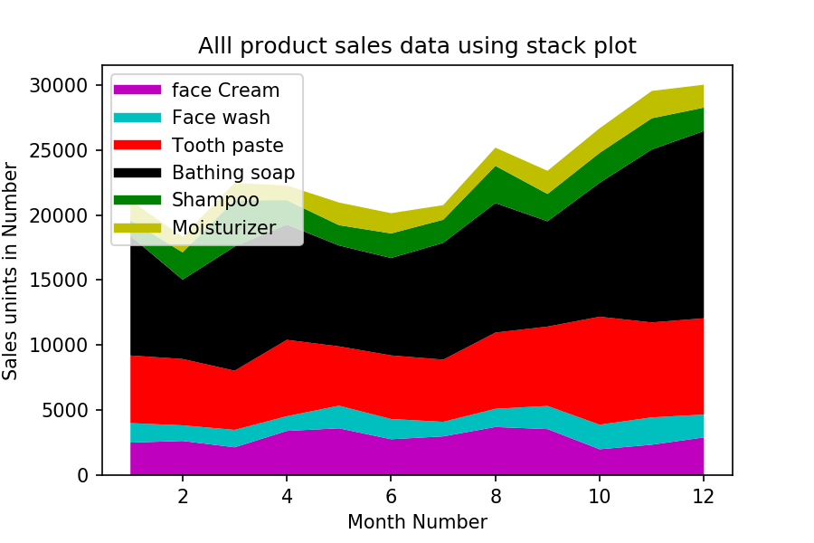
Exercise Question 10: Read all product sales data and show it using the stack plot
The Stack plot should look like this.
Hey in matplot part i am not able to change the colour of the image as it’s showing error with no such file as jpg is found kindly help.
Hey Vishal,
Its a great work you have done here and thank you for sharing this exercises for the community.
In q3 I just made a small change by reducing the number of code lines :
x = df[‘month_number’].to_list()
r = len(df.columns) – 2
for i in range(1,r):
plt.plot(x,df[df.columns[i]], marker = ‘o’, linewidth = 3, label = df.columns[i])
plt.xticks(x)
plt.xlabel(‘Months’)
plt.ylabel(‘Units Sold’)
plt.legend()
plt.show()
When you are adding detailed tutorials for Matplotlib as well?
I’m having a hard time applying what i learned in the loop exercises to matplotlib. Is it possible to set an exercise that produces say 10 graphs from df using a for loop?
Hello,I have a question.How can I add value labels in Exercise 5?
Hi Vishal…
Hats off to you you have done a wonderful job by creating these exercises …it’s not only useful for those who are students but also for those who are working…
Hii its awesome and it helped me so much.Is there any link where i can get the same answers in plotly instead of matplotlib
Thanks bro, its really helped me in practicing matplotlib……..
How to smoothen stack plot? same graph but It should be curvey. please help
it definitely gives a great platform for students to practice. pls include box plot also
In Problem number 2 I found a couple of errors. One the moisturizer data is the same as Face wash. I am not sure if they are supposed to be the same thing but it over writes the face wash data on the plot. The other is the label on the the plots is ‘Toothpaste’ when it should be others just a copy and paste error.
I found these problems very helpful! Thank you.
have a doubt regarding pie chart . “Pie chart display Number of units sold per year for each product in percentage”.what if there are more(2000) products then how do we name the labels whith-out naming them individually
I have downloaded the CSV file. But this file is not getting converted to DataFrame format – giving the following error message:
” SyntaxError: (unicode error) ‘unicodeescape’ codec can’t decode bytes in position 2-3: truncated \UXXXXXXXX escape”
Can you advise how to overcome it?
Can you please try to solve using this StackOverflow link. Let me if it helps you
It is because You must be accessing it with the path that contains “C:\Users….”. Here \U creates difficulty. You should put r before the path So that it path is read as raw string.
Example:
pd.read_csv(r"Your Path")Hi Vishal,
These are very good exercises to learn python,
Thank you providing these exercises.
Thank you, Vishnu
Excelent place to learn everything in Python . Congratulations!!!
Thank you Nelson
Could you please explain autopct=’%1.1f%%’ in q8?
Also how to use various brackets? im confused. I mean how do u know [] or () come to which places?
Hi Lakshmi Yapa,
autopctenables you to display the percent value using Python string formatting. For example, if autopct=’%.2f’, then for each pie wedge, the format string is ‘%.2f’ and the numerical percent value for that wedge is pct, so the wedge label is set to the string ‘%.2f’%pct.To add percentages to each of the constitutents of the pie chart, we add in the line, autopct=’%1.1f%%’, to the plt.pie() function.
This formats the percentage to the tenth place.
If you want to format the percentage to the hundredths place, you would use the statement, autopct=’%1.2f%%’
If you want to format the percentage to the thousandths place, you would use the statement, autopct=’%1.3f%%’
HI Vishal,
I just wanted to thank you for this great lessons. Keep it up. I love the way u r coding.
Just 1 request.
Could you please add some comments to the difficult point in the solutions?
it would be so much helpful to the beginners like me.
Thanks
Thank you. I will modify it and add comments to a difficult point in the solutions.
Very good practice opportunity….very well programmed
I am gald you liked it.